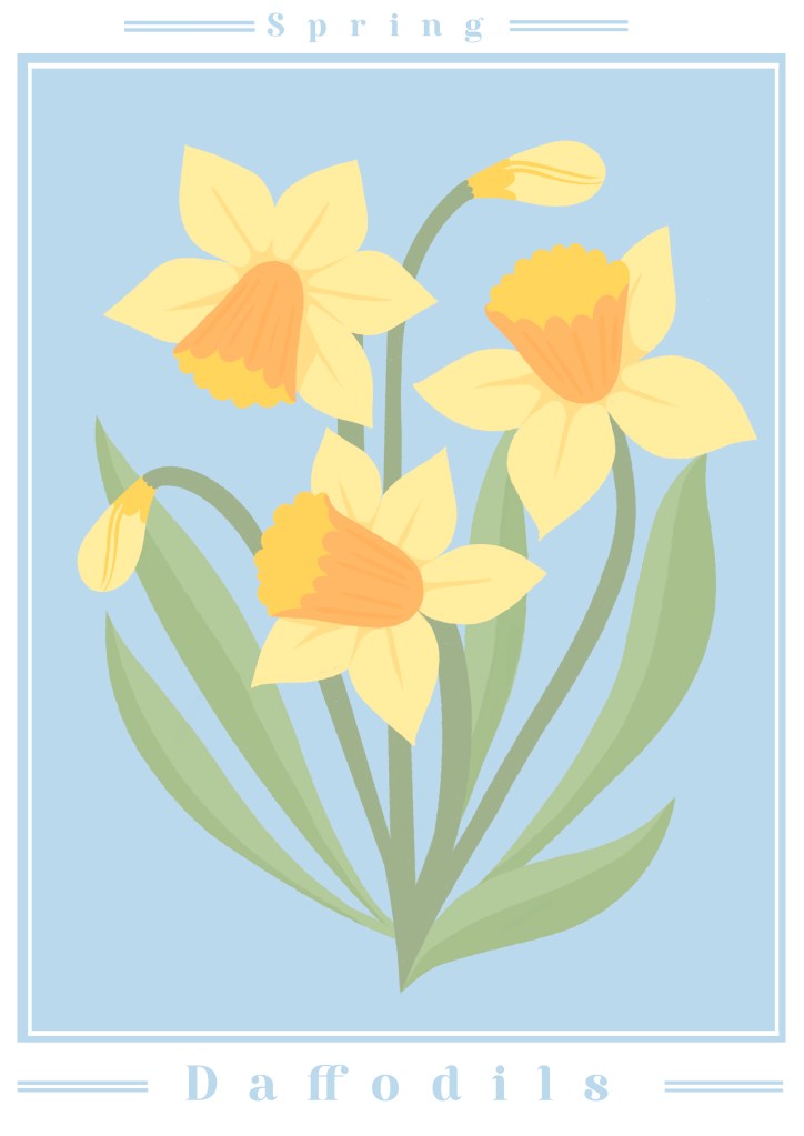
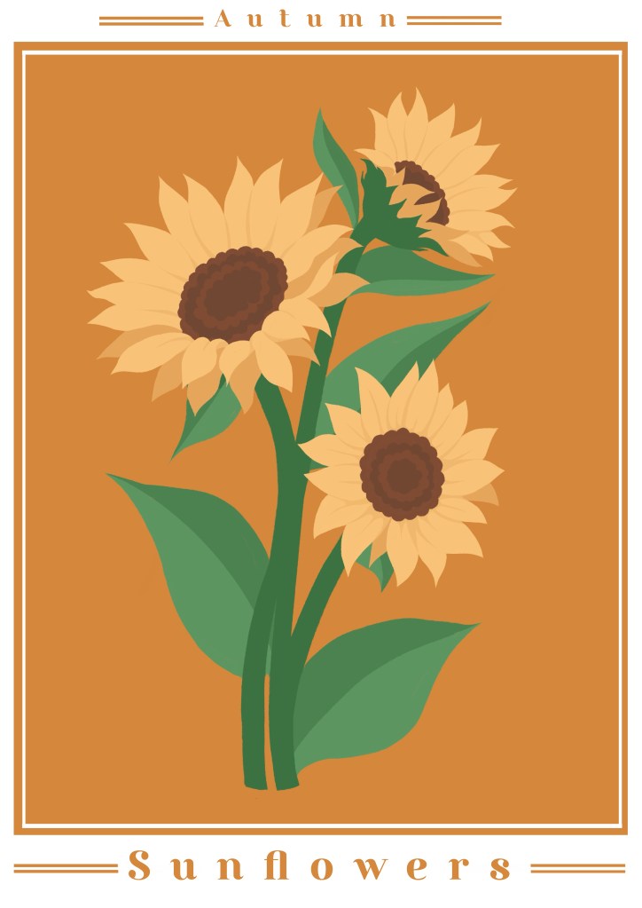
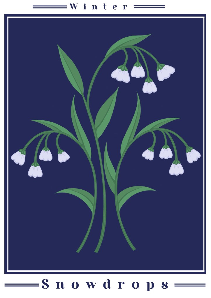
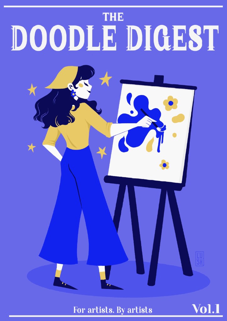
illustration portfolio
since i was around the age of 4 i have always loved art. I cannot remember a time where I wasn’t either drawing or cooking up an idea for one. Ive always had a huge draw (pardon the pun) to anything creative. My journey to discovering who i am as a creative has been a long one but one of the most developmental stages for me was during my studies. I studied BA Illustration at Teesside University, where I developed my skills across a range of different illustration styles and techniques. Throughout my degree, I experimented with both traditional and digital media, allowing me to adapt my work to different audiences and purposes. Over time, my practice developed from exploring a wide variety of approaches to finding a style that reflects my own interests and creative strengths. Working in different styles has also helped me become more flexible as an illustrator, making it easier to respond to different briefs and projects.
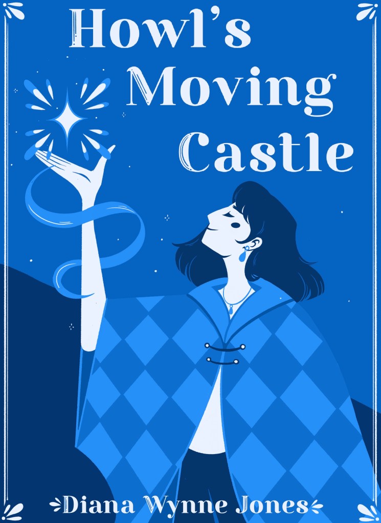
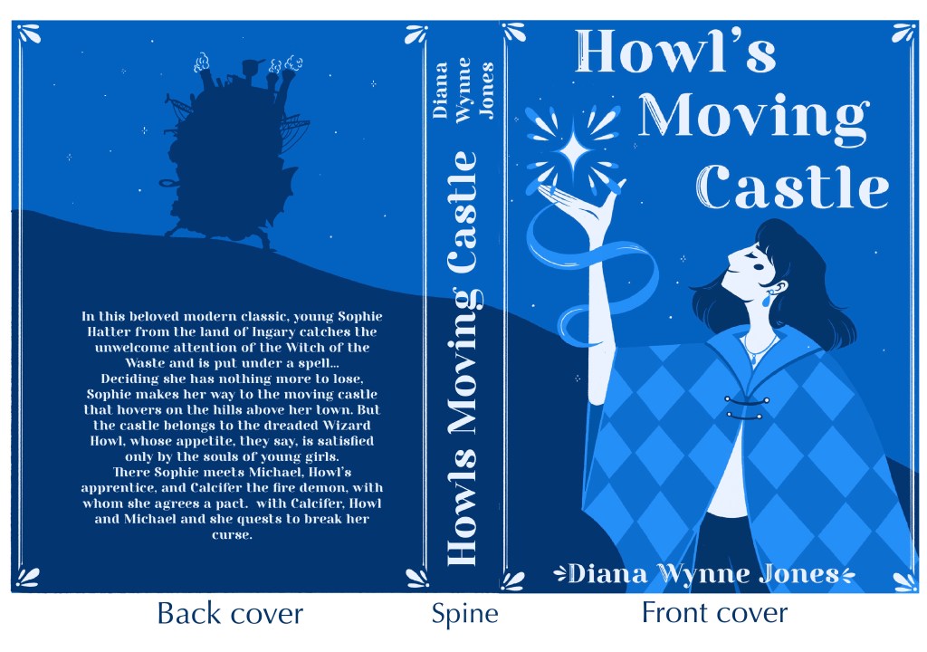
book cover design
The design process for this book cover began by researching the themes and characters in Howl’s Moving Castle. I wanted to create a simple but eye-catching composition that reflected the magical atmosphere of the story. I used a limited blue colour palette to create a calm, dreamlike mood and focused on the character of Sophie to make the cover more personal and recognisable. Decorative details such as the glowing magic, stars and patterned cloak were added to make the design feel more fantasy-based, while the silhouette of the castle on the back cover helped connect all sides of the book together.
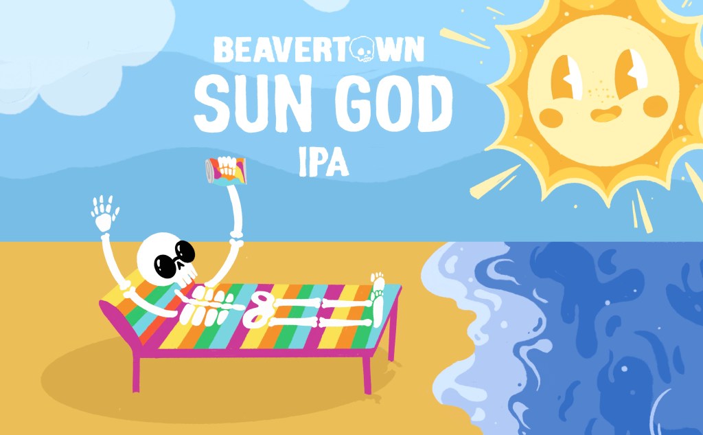
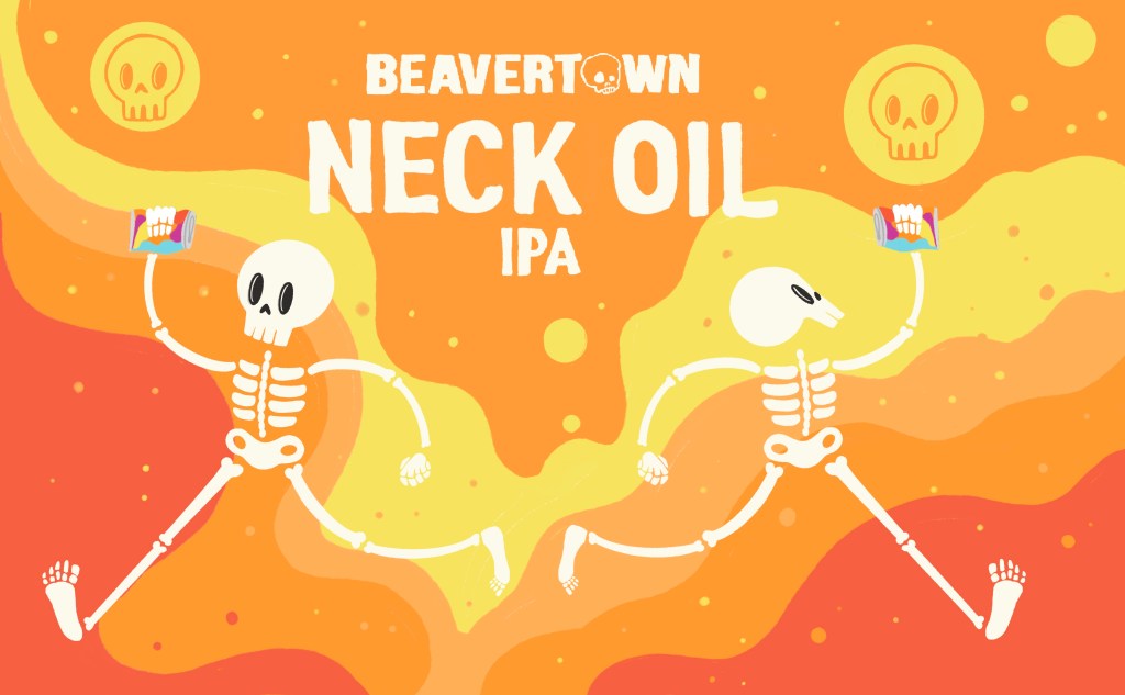
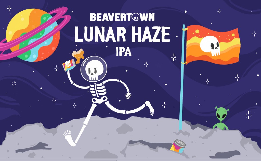
These label designs were created as part of a university branding project inspired by Beavertown. I wanted to capture the bold, playful style that the brand is known for, while creating unique visuals for each beer. I used bright colour palettes and simple character-based illustrations to make the labels eye-catching and energetic. For Sun God IPA, I designed a relaxed beach scene with a skeleton character and a large cartoon sun to reflect the summery theme. For Neck Oil IPA, I created a more energetic composition with running skeletons and warm orange tones to give the design a lively and fast-paced feel. Throughout the project, I focused on creating illustrations that matched the existing Beavertown aesthetic while still showing my own creative approach.